On Design
I had a friend who played guitar. Well, he had a guitar. And, in pursuit of learning how to play it, he'd watch videos of like Stevie Ray Vaughan or whoever on loop and he'd think "Jeez, I could never do this!..." And so he stopped trying. And then he sold the guitar.
The moral of the story is that, if he'd just start small and simple and build up to the advanced stuff, today he'd be a perfectly content guitar player owner.
And I tell that dumb story because, when people talk about design, I think it's just as often discouraging as it is encouraging. Examples of "good design" are market-validated. Apple will sell 200 million phones this year, but if we're not gonna make iPhones, then why bother?
So, before we have any conversation about Design-With-A-Capital-D, I first want to outline a process of how I think about making electronic musical things:
A maker's design/development lifecycle
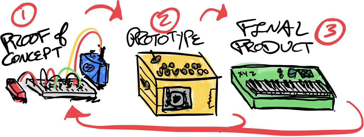
- Proof of Concept (PoC)
- This is the breadboard version of a machine, with its main function(s) working but limited in functionality and control. It is probably table-bound, a little delicate, and requires assistance to be used because nothing is labelled.
- For example, an oscillator has a couple buttons to play different frequencies, and its output connects to a cheap guitar amp.
- The goals are to prove that the basic premise is both 1) technically feasible and 2) worth the effort to continue. You might call it a technical demo.
- Prototype
- A prototype takes the PoC off the breadboard and into the real world. It's soldered up to withstand being handed around and probably in a crude enclosure to protect it from the elements.
- It should be closer to feature complete but doesn't have to be exhaustive. Ugly but not-unintuitive is perfect.
- Continuing our Proof of Concept example, now the oscillator has buttons for a full, tuned octave of notes and the amp is built-in. There's a switch for power and maybe a switch for a filter too. Oh, and it's all in a cardboard box with all the components poking out.
- Enclosing our circuit starts to abstrtact away its complexity. It's no longer a jumble of electronic components but a singular machine. "The whole is greater than the sum of its parts." It has a permanence!
- The goal of a prototype is user testing. Carry it around with you. Is it fun to play? Let someone else try. Are they able to use it without your assistance?
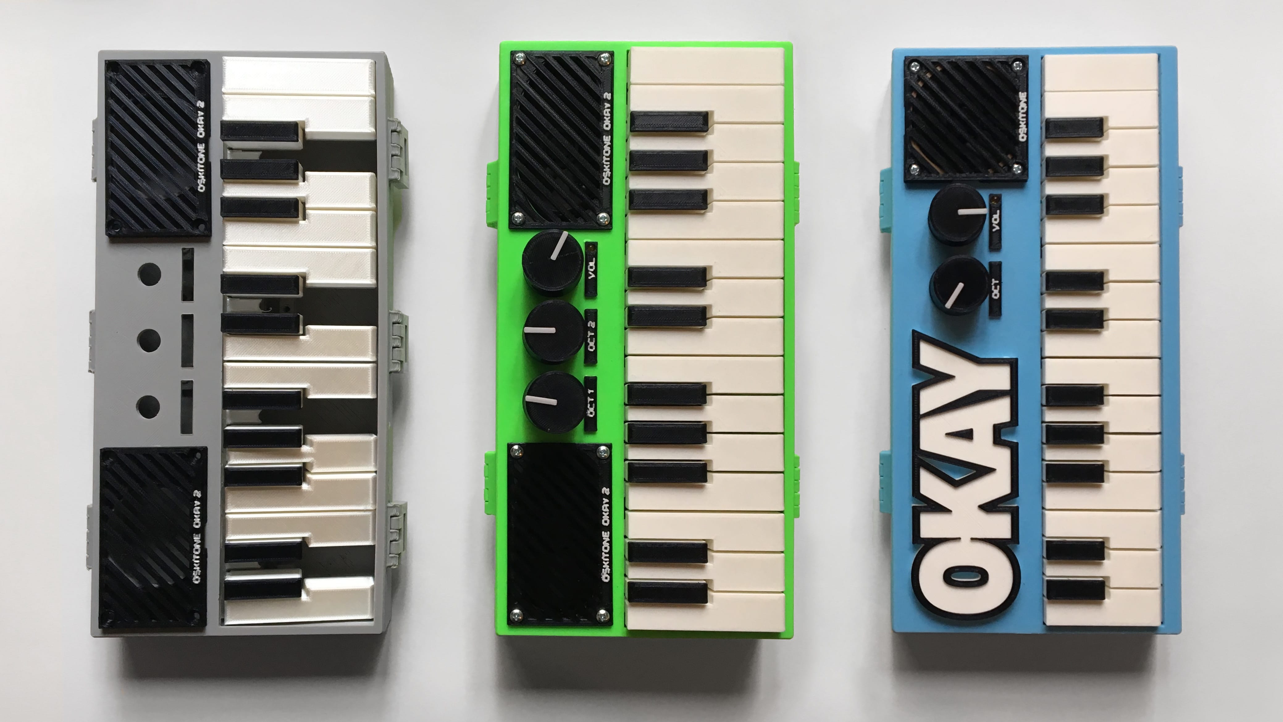
- Finished Product
- This version is what you could imagine sitting on a store shelf or on a nice display in your home — it is "shelf-worthy."
- Okay, maybe "product" isn't the right word because you don't have to sell it. Pretend it's a very nice gift for somebody.
- Our cardboard prototype now has multiple octaves of buttons, and you've figured out how to cap them with fake piano keys. The filter switch is replaced by a knob or two for more control, and there's a bigger knob for volume. It's made of something sturdy like wood or plastic or metal.
- In startup land, a "Minimally Viable Product" (MVP) is one that reduces the feature set to the bare minimum of what people will pay money for.
- The goal of a product is probably money, but yours can be pride or a sense of achievement or learning or anything else that validates your hard work!
Distinctions between stages are blurry, and they can overlap. The important takeaway is that the core functionality of the machine is understood and working from start to finish, and you iterate incrementally. You don't just go straight to the end!
Stages can also loop and cycle, individually or in a subset. You could go through multiple Proof-of-Concepts before you find one you like, with multiple prototypes as you build out its features; and an MVP makes a great base framework to PoC new functions.
Some open questions to consider:
- What's missing? How would an investor or marketer or teacher disagree?
- How much do you value or enjoy each stage? Are the first two stages worthwhile if you don't get to the third one?
- Okay, sure, but where does design fit in?
Design principles
The field of designing products for mass production is called Industrial Design, and the Design of Everyday Things by Don Norman is its bookshelf staple.
These are its "Principles of Interaction Design," with commentary for our usage:
- Visibility
- The more visible something is, the more likely users will know about it and use it
- A big friendly knob will get turned a lot, a little knob once and awhile, and a tiny trimpot you can only access from the bottom with a screwdriver hardly ever. "Easy" is to "often" as "hard" is to "rare."
- Examples: the stomp switch on top of a guitar pedal vs the battery cover on the bottom, accessible presets for common parameters, big pads on a drum machine
- Feedback
- Making it clear what action is being done and what it accomplished
- I think of this as "Be responsive." A lot of times when we think a machine or program is broken, its interface is really just unresponsive but it's functioning otherwise perfectly.
- Examples: a lit LED to say the machine is on or working/saving/loading, beeps when moving around menus or making selections; the "CLICK" from our tacile switches is mechanical feedback too.
- Constraints
- Limiting the range of possibilities to simplify the interface and guide towards the appropriate action
- Appropriate also means useful. All electronic musical instruments can technically play frequencies beyond what our ears can hear, but who would that be for? Dogs?
- Potentiometers are prime constraint candidates. We can pick pots with ranges that play well with our circuits, and we can shift their range with serial resistors.
- Examples: chromatic vs diatonic harmonicas, sequencer min/max tempos
- Mapping
- Clear relationship between controls and their effect
- The better the mapping, the less explanation.
- The textbook example is stovetop range controls in a 1x4 line despite the burners being a 2x2 grid. How often do you turn on the wrong burner? What text/icons are on the machine to denote the mapping?
- I've heard a version of this as "Proximity implies relation". People perceive things near each other as related. If stoves have knobs right next to their burners, there's less room for error.
- Examples: recorder level sliders in a row, string instruments have their keys/frets ordered from low-to-high
- Consistency
- Similar things for similar tasks. Inversely, dissimilar things for dissimilar tasks.
- A common confusion on complex machines is false consistency, where similar controls have dissimilar tasks. Think buttons with "alt" functions or the inverted keys on a Hammond for presets. The user has to know these controls have a special secondary operation.
- Other examples: piano keys all of the same dimensions and layout, organ drawbars with colors for certain intervals, color-coded mixer knobs for EQ/pan/level
- Affordance
- An implicit visual suggestion about how something is supposed to be used
- It's a clue! A chair's cushion tells you where to sit — it invites you to use it in a specific and obvious way, without a word of written instruction. You might call it intuitive or self-evident.
- The more people will understand it, the better. The strongest affordances rely on physicality shared by all/most humans; lesser ones rely on culture or idiom or genre. The weakest are contextual to the instrument itself.
- I think this one is easy to misapply or do naively. I've seen enough screws hammered into wood to know that nothing is obvious to everybody. But it's still a worthy goal!
- Examples: a padded drum throne to sit on and pedals where your feet will be, black and white piano keys for Westen musical scales, an LED next to a volume knob to convey that it's also an on/off switch.
Paths vs puzzles
All of that is well and good and worth considering, BUT we're making novelty musical instruments and noise machines, not helicopter cockpits or hospital equipment! God willing, nobody's life will ever depend on what we'd make with a CD4093 Quad NAND Schmitt.
Keep or ditch design rules as you like. Not everything has to make sense. There's a lot of joy to be had in making a weird, harmless thing to confuse people.